In today’s digital landscape, people access the internet using a wide range of devices – from desktops and laptops to smartphones and tablets. As a result, it has become essential for websites to provide a seamless and consistent user experience across all screen sizes. This is where Responsive Web Design (RWD) comes into play.
Responsive web design ensures that your website looks and functions well on any device, whether it’s a large desktop monitor or a small smartphone screen. In this blog, we’ll explore what responsive web design is, why it’s important, and how you can implement it to create a better user experience.
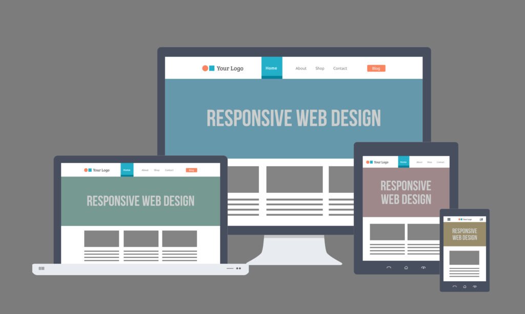
What is Responsive Web Design?
Responsive Web Design (RWD) is a web development approach aimed at crafting websites that adapt to the user’s device, providing an optimal viewing experience. This means that the layout, images, and text on a website automatically adjust to fit the screen size and resolution of the device being used.
In simpler terms, RWD eliminates the need for creating separate websites for different devices. Instead, one responsive website design ensures that your content is accessible and visually appealing across all platforms.
Key Components of Responsive Web Design
Several techniques and technologies work together to create a responsive design. Some of the most important components include:
- Fluid Grid Layouts:
A fluid grid uses relative units like percentages rather than fixed units like pixels to define widths and spacing. This allows the layout to adjust smoothly to different screen sizes. - Flexible Images:
Images in responsive web design are scaled based on the user’s screen size. Instead of using fixed image sizes, responsive websites use CSS to ensure images shrink or grow based on the available space, preventing them from being too large or too small on different devices. - Media Queries:
Media queries are a key component of CSS that allow web pages to detect the screen size and resolution of the device being used. Depending on the result, different styles can be applied, optimizing the layout for the specific device. - Viewport Meta Tag:
This HTML tag helps control the layout on mobile browsers by instructing the browser how to adjust the page’s dimensions and scaling. It ensures that the page is scaled correctly on mobile devices without requiring horizontal scrolling.
Why Responsive Web Design is Important
- Enhanced User Experience:
The primary goal of responsive web design is to offer users an optimal experience, regardless of the device they are using. A responsive website prevents users from having to zoom in and out, scroll horizontally, or deal with poorly aligned images and text. A seamless experience keeps users engaged and improves overall satisfaction. - Improved SEO:
Search engines like Google prioritize websites that are mobile-friendly. In fact, Google has introduced mobile-first indexing, meaning it predominantly uses the mobile version of the site for ranking and indexing. A responsive website improves your site’s ranking and visibility in search engine results, which is crucial for attracting traffic. - Cost-Effective and Time-Saving:
Maintaining one responsive website is far more efficient than creating and managing separate websites for different devices. With responsive design, you only need to maintain one codebase and content strategy, which reduces the development time and maintenance costs. - Future-Proofing Your Website:
With the continuous evolution of technology, new devices with varying screen sizes are being introduced regularly. A responsive web design ensures that your website is equipped to handle any future devices without requiring constant redesigns. - Faster Loading Times:
A responsive website is optimized to load quickly on all devices, especially on mobile. Faster loading times lead to lower bounce rates, which means users are less likely to abandon your site due to slow performance. It also improves your site’s ranking on search engines. - Increased Conversion Rates:
Consistency across devices ensures that users don’t get frustrated when switching from one device to another. A positive and user-friendly experience increases the chances of users completing desired actions, such as purchasing a product, filling out a form, or contacting your business, resulting in higher conversion rates.
Best Practices for Implementing Responsive Web Design
- Mobile-First Approach:
Start by designing for the smallest screen size (mobile) and gradually scale up to larger screens. This ensures that your website is optimized for mobile users first, who now make up the majority of web traffic. - Use a Fluid Layout:
Design your website using flexible grid layouts. Avoid using fixed widths for elements, as this can result in content being cut off or misaligned on smaller screens. - Optimize Media:
Ensure images, videos, and other media elements are optimized for different screen sizes. Use tools like CSS to make images responsive and consider using scalable vector graphics (SVGs) for icons and logos to ensure they look crisp on all devices. - Test Across Devices:
After implementing a responsive design, test your website across various devices and browsers to ensure consistency. There are many tools available online, such as Google’s Mobile-Friendly Test or BrowserStack, that allow you to see how your website performs on different platforms. - Keep Navigation Simple:
Ensure that your website’s navigation is easy to use, especially on smaller screens. A common practice is using a hamburger menu on mobile devices to save space and keep the interface clean. - Reduce Load Times:
Users expect websites to load quickly, especially on mobile devices. Compress images, minimize HTTP requests, and reduce file sizes to ensure your website is fast and responsive.
Examples of Responsive Web Design
- Techstertech.com
At Techstertech, we specialize in responsive web design, ensuring that our clients’ websites provide a seamless experience across all devices. We use modern techniques and tools to create websites that are both functional and aesthetically pleasing. - E-Commerce Sites
Many online stores prioritize responsive design because they understand the importance of mobile users. Websites like Amazon and eBay are excellent examples of responsive design, adapting perfectly to mobile, tablet, and desktop users. - News Portals
Websites like CNN and BBC are prime examples of responsive web design. These platforms need to ensure readability across all devices while displaying a large amount of information in a structured format.
Conclusion
Responsive web design is no longer just an option – it’s a necessity. With the majority of users now browsing the web on mobile devices, a responsive website ensures that your content is accessible, engaging, and functional on any device. It not only improves user experience but also boosts your SEO efforts, enhances site performance, and reduces development costs.
If you’re looking to make your website responsive or want to start a new project with a mobile-first approach, Techstertech.com is here to help. Our team of experts can create a website that looks stunning and performs excellently across all devices.
For more information on how we can help you with responsive web design, visit Techstertech.com today!